Contact Us

Use the form on the right to contact us.

You can edit the text in this area, and change where the contact form on the right submits to, by entering edit mode using the modes on the bottom right. 


123 Street Avenue, City Town, 99999

(123) 555-6789

email@address.com


You can set your address, phone number, email and site description in the settings tab.
Link to read me page with more information.

House Curious

Lifestyle and interior shop. Social workshops for the creatively curious.

Filtering by Tag: homestyle

House Destinations - Scandinavia

Sommer Pyne

Photo by Nick Karvounis

Next stop on our whistle stop tour of stunning properties around the world is Scandinavia which is made up of 3 countries in northern Europe, Denmark, Norway and Sweden. Scandi design have gained notoriety for their love of interior design and clean modern design over the last decade and the Scandi trend continues to flourish. We take a look at 5 unique properties and their interior style. We hope you enjoy and can take inspiration from them.

Photos by Jacob Gils

Photos by Jacob Gils

Summer Haus

Zealand, Denmark

First up is Summer Haus just north of Copenhagn this holiday home belongs to Danish Jewellery Designer Charlotte Lynggaard. Situated by the coast this property looks right at home, with its weathered wooden cladded exterior. The gardens are planted with plants that thrive in this environment, there is also a kitchen garden that the owners grows fruit and veg in, which we just love.

Photos by Mark Seelen

Photos by Mark Seelen

The interiors of this property are very true of the scandi aesthetic, the colour palette is simple and considered. Owner, Charlotte was also influenced heavily with Japanese minimalism and decor. Light in scandi properties is very important as the winters are long and dark, so designers and architects try to fill rooms with as much natural light as possible. The homes often have open plan living, raised ceilings and large windows to allow light to flood in.

The large kitchen diner is a true representation of all the scandi things we love.

Photos by Mark Seelen

Photos by Mark Seelen

Natural materials feature heavily and the furniture and soft furnishings add character and personality. The mix of neutral colours with accents of blues and slate reflect the landscape on which the house sits. In the living room the large crittall windows in white keep the space feeling bright. A gallery wall in a great way to showcase artwork. The low sofas are a nod to the japanese influence.

Photos by Mark Seelen

Photos by Mark Seelen

The study pictured above features a floor to ceiling bookcase with ample storage in a custom size and layout. A bookshelf like this is also a good space divider in open plan living - it would also work well in small spaces like a studio to break up the space and create useful storage.

Photos by Mark Seelen

Photos by Mark Seelen

The master bedroom is white and bright with blue accents. Built in closet space keeps the room feeling minimal whilst providing much needed storage. Select antique pieces are dotted around the room and bring character to very neutral space. Less is definitely more in this room.

Photos by Mark Seelen

Photos by Mark Seelen

Outside the views are breathtaking over the sea and where better to sit and take it all in, than in an outdoor bathtub. Just imagine waking up to that view every morning!

Photos by Mark Seelen

Photos by Mark Seelen

The way this home is accessorised and styled in simple but elegant, with richly textured fabrics, perfectly placed ornaments, plants, cushions and throws. Art is important with large abstract pieces that are placed around the home in a simple and uncluttered way.

Key features we love:

  • Outdoor bath tub

  • Simple colour palette

  • High ceilings

  • Crittal doors/windows

  • Weathered cladding

Source: Est Living and Modafamilia.com

Home of NOMA Chef René Redzepi

Christianshavn, Copenhagen, Denmark

Next up is a home full of character and rustic charm the property is a 200-year-old former blacksmith’s workshop. Which belongs to René Redzepi the chef behind NOMA, the Copenhagen venue awarded Best Restaurant of the World three times. The interiors of this home have nods to the Noma style and Rene’s dedication to high quality, craftsmanship and Nordic heritage. The oak floors and exposed beams are a total reflection of this.

Massey_LivEtc_Redzepi_00186.jpg

In the kitchen the owners have kept original blacksmith’s furnace in the kitchen which is a unique feature. Not only is this a focal point but it keeps the house warm in the colder months, which is much needed in this part of the world.

Oak features heavily in this home, with beautiful cabinetry in the kitchen and bathrooms. The stairs are also a beautiful example of craftsmanship. The kitchen island is a central feature of the kitchen and houses plenty of storage.

Photos: Paul Massey

Photos: Paul Massey

Photos: Paul Massey

Photos: Paul Massey

The home is furnished in an unpretentious, timeless and simple fashion. There are beautiful pieces of furniture that have been sourced from flea markets and second hand stores that compliment the age of the property.

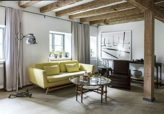
Colour is used in a subtle way in this home, from the butter yellow sofa, soft lilac curtains to the mint green window frames in the kitchen it’s uncomplicated and delicate.

Photos: Paul Massey

Photos: Paul Massey

Photos: Paul Massey

Photos: Paul Massey

The master bedroom is very simple and it’s the original character features that make this room special. There is however a unique fireplace opening to the chimney breast allowing the heat from the furnace below to escape. The pitch of the roof with it’s skylights invites light in and the dramatic beams add so much to this room.

Photos: Paul Massey

Photos: Paul Massey

Above is a fun child’s bedroom, we love this extreme bunkbed and long ladder leading up to it. This is a great way to make the most of a smaller space. The built in closets allow clothes and toys to be kept tidied away. We love how this room is styled with a few key toys.

Photos: Paul Massey

Photos: Paul Massey

The bathrooms reflects the feel of the rest of the house with warm wood, dark slate and bronze accessories that create a spa like vibe.

Key features we love:

  • Wooden beams and oak flooring

  • Beautiful cabinetry

  • Neutral colour palette with soft drops of colours

  • Extreme bunkbed

  • Original features

Sources Living etc and Nordicdesign.ca

large-5.jpg

The Glasshaus

Gothenburg, Sweden

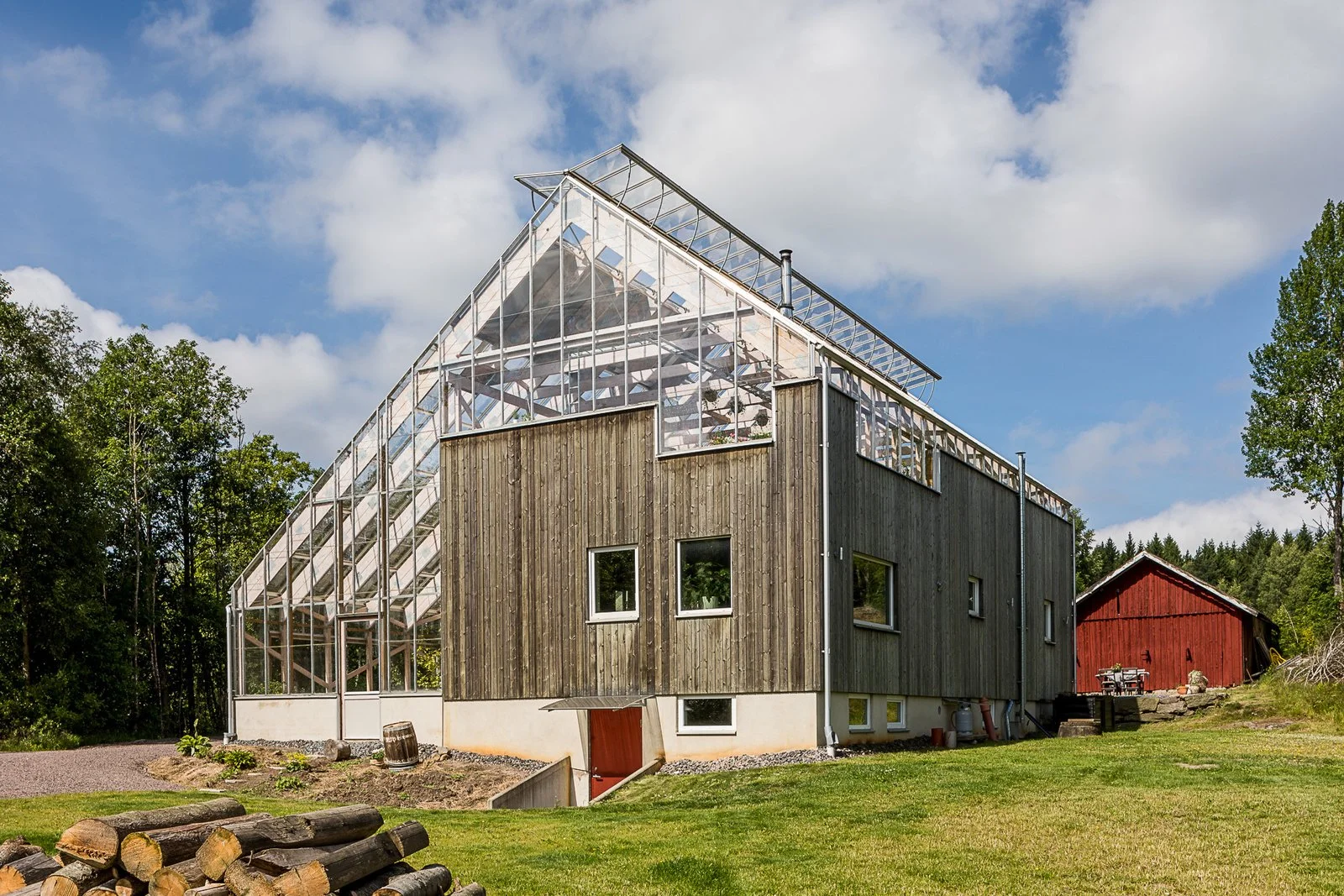
Now we hop over to Sweden to this unique eco-friendly lakehouse complete with an impressive roof terrace that is encapsulated with a greenhouse like structure.

large-2.jpg
large-3.jpg

This A-frame greenhouse contains a three-bedroom, two-bath home that protects the owners within from the freezing winters whilst keeping the energy bills low. With a big focus on the environment and eco-living they have incorporated energy efficient technology and solar panels to reduce the homes footprint.

The greenhouse aspect of this house creates the perfect climate to grow fruit and vegetables indoors all year round adding to that eco-living ideal.

large-4.jpg

The scenery that surrounds this property is gorgeous. The jetty on the lake is so inviting it makes us want to run and jump in.

large-1.jpg

The interior roof terrance is very impressive and is a great entertaining space.

large-6.jpg

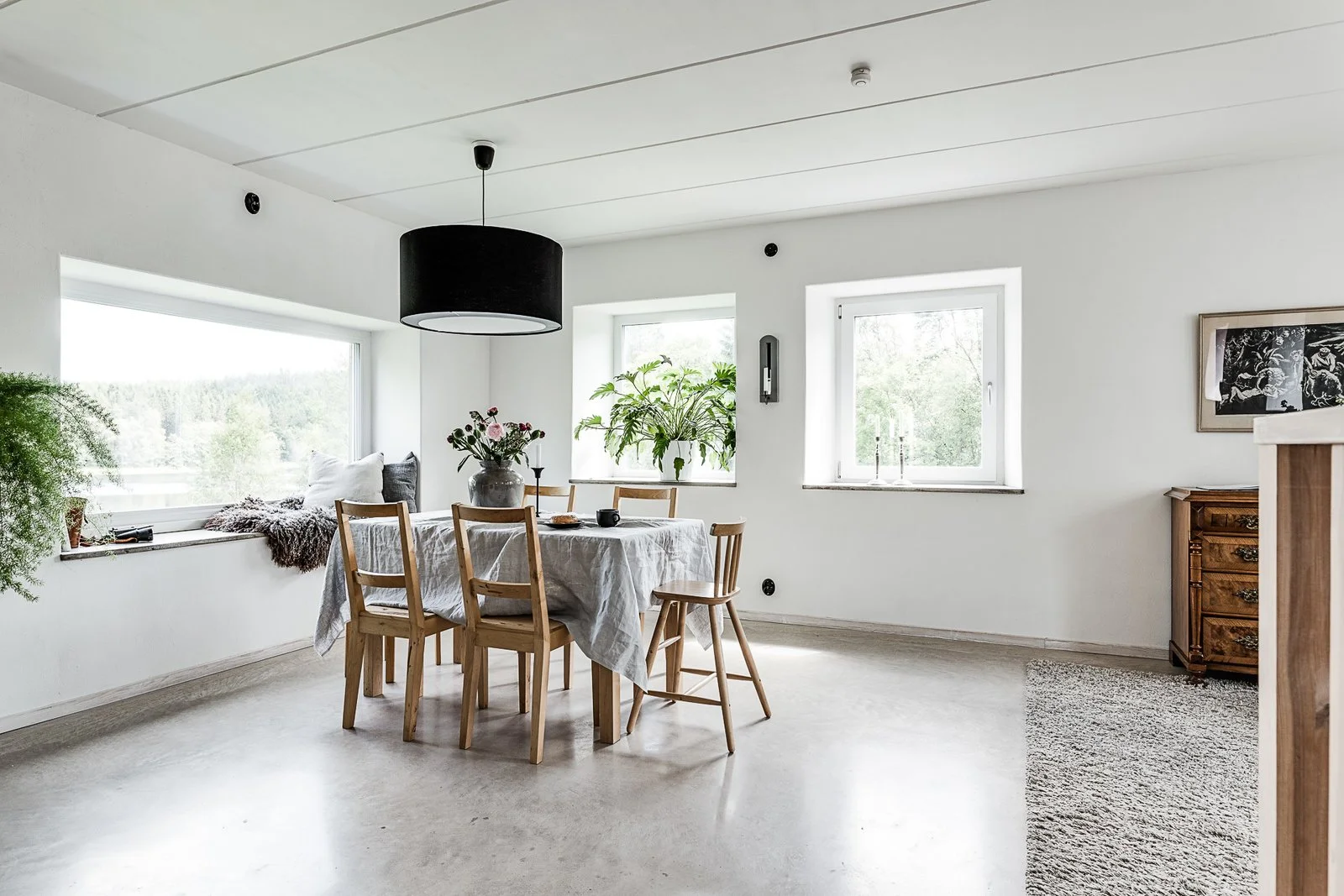
White walls and polished concrete floors reflect the light to create bright interiors. There is an industrial feel to the home and the light fittings fit in well this asthetic.

large-7.jpg
large-9.jpg
large-8.jpg

The finish of the interiors is very simple and minimalist, white, grey and chrome is the colour palette. With interjections of natural wood.

large-11.jpg

The greenhouse element of this home is very dominant and striking and we feel inspired to go more green.

Key features we love:

  • A-frame structure

  • Eco friendly set up

  • Polished concrete floors

  • Interior roof terrace

Source Dwell

Eclectic Home

Sweden

This is the home of Christian Duivenvoorden and his partner, owners of Artilleriet, an amazing decor and furnishings store in Gothenburg. The interiors of this property totally reflect their style and all the things they love from their store.

It’s a stunning place with a fabulous and eclectic style, thanks to a perfect blend of vintage finds, iconic pieces and modern design.

The rooms have high ceilings, long windows and french doors which allow light to flood in. All the rooms are painted white, off white or cream colour, which helps light bounce around. As we have discussed earlier in the blog post light is very important especially this far north in the winter months.

As for materials in this home it is again very simple and paired back with exposed wooden floorboards. The colour palette are whites, creams, greys and black with a mix of natural wood and glass. Everyday objects are on show from the wooden chopping boards to bowls and glassware.

A focal point in this the dining area is the vintage log burner. The furniture is a curated selection of mismatched pieces. The tall backed wooden bench is softened with a gorgeous dark sheepskin and feels very much part of the scandi trend.

Plants bring the only real colour into this home and can be found in most of the rooms. Each one is beautuflly displayed in a variety of concrete pots, black pots and at a varying heights.

In the living room they have used lot’s of textures, the sofas have white linen loose covers that have a relaxed vibe. This is mixed with a variety of textures from the berber style rug, velvet cushions, sheepskins and woollen blankets to add a cosy feel. Don’t be afraid to use white in your home especially when it comes to sofas etc, these loose cover can easily be removed and washed.

The bedroom is very chilled space, again using lots of linen and layers of whites and greys. Lighting in this room is kept simple with a focus on down lights and lamps that can be moved to create a cosy atmosphere.

Modern elements come through more obviously in the kitchen and bathroom. The kitchen has a striking modern black oven that blends into its surrounds. The white metro tiles with black grouting provide a classic back drop to the kitchen with chrome appliances. Some might say that metro tiles are over used but I think they are a classic and look great in most homes.

The last room that we are looking at in this property is the bathroom, the modern white bath tub sits on industrial style black floor tiles. With a repurposed wooden cabinet that provide lots of storage and space for the black basin, mirror and tray full of goodies.

Key features we love:

  • Simple white bath tub

  • Bamboo and silk statement light in the living room.

  • Berber style rug

  • Vintage wood burner

  • Modern black oven.

  • White metro tiles with black grouting

Vega Island Hideaway

Norway

The last property we’re visiting is in Norway, hidden away on a remote island called Vega just south of the artic circle. The weather beaten fisherman cottage sits on the rocks of the island. Designed by the Stockholm-based studio Kolman Boye Architects, the exterior is clad in pine that will wear into a grey that will blend with the dark trees and rocky landscape. Timber features heavily on the exterior and interior of the property.

Birch kitchen cabinets and shelves, steel countertops and natural textiles play against a background of whitewashed wood and natural birch, reflecting that incredible light. Floor to ceilng window feature though out the home.

Rooms are arranged on two levels that follow the land’s topography. The lower level is a lofty open-plan living area with a kitchen, dining table and snug sitting area, all arranged around a central stone fireplace, which is the heart of this home.

The upper level houses two double bedrooms and a bathroom; there’s another small double bedroom up in the attic, making this a great getaway for a family or close friends. Every detail is considered; nothing detracts from those mesmerising views.

As for the interior cladding, the timber has been kept light to create a spacious atmosphere. Unfinished birch was used for the window frames and skirting while the wood used for the walls, ceilings and floors has been whitewashed and treated with linseed oil. The interior design remains emphatically scandinavian: simultaneously cutting edge and traditional.

The double volumed form of the house was heavily based on the compositions of traditional fisherman’s boat sheds found on Vega Island. Due to the uneven boulders that Vega Cottage is built on, one half sits slightly higher than the other.

Key features we love:

  • Simple structure

  • Wooden cladding

  • White washed birch interiors

  • Steel countertops

  • Incredible location

Source http://homeli.co.uk and Off Grid Hideaways

For more in this blog series click here for House Destinations - Australia and click here for House Destinations - America.

House Destinations - America

Sommer Pyne

Photo - Viviana Rishe

In this weeks instalment of our blog series House Destinations, we explore homestyle inspiration across the pond in America. Looking at it’s two contrasting coasts and everything that lies in between. We explore properties in several different states that illustrate the varying landscapes and how architecture and interior design play off their surroundings.

Photo Source : Trevor Tondro for Architectural Digest

Photo Source : Trevor Tondro for Architectural Digest

Los Angeles, California

Fun Jungle Retreat

First up is the home of Poppy and Cara Delevingne, this house is the true meaning of fun with a Playboy pinball machine, bold palm print wallpaper, a nautical bar, a swimming pool and a stripper pole. It’s the complete opposite of the traditional British interiors they grew up with and we can’t get enough.

Photo Source : Trevor Tondro for Architectural Digest

Photo Source : Trevor Tondro for Architectural Digest

The property that the sisters share dates from around the 1950s, located on a quiet LA street nestled between palm trees and lush greenery for that LA urban jungle vibe. The house is laid out with a pair of master suites on different floors and with two separate entrances. The vision of this fun space has been brought to life by architect Nicolò Bini of L.A.–based Line Architecture, who worked closely with the Delevingne’s to bring their dream to life.

Photo Source : Trevor Tondro for Architectural Digest

Photo Source : Trevor Tondro for Architectural Digest

Photo Source : Trevor Tondro for Architectural Digest

Photo Source : Trevor Tondro for Architectural Digest

Photo Source : Trevor Tondro for Architectural Digest

Photo Source : Trevor Tondro for Architectural Digest

Bini’s describes the style as having nods to midcentury modern, Laurel Canyon bohemia, Beverly Hills swank, surfing culture, and a little Mexico. The prints and colour used throughout the home are so vibrant and bold they burst life into each room. Palms trees, birds of paradise and hanging plants feature heavily throughout the house adding life to each room.

Photo Source : Trevor Tondro for Architectural Digest

Photo Source : Trevor Tondro for Architectural Digest

Each of the girl’s bedroom suites represent their own individual personalities. Older sister Poppy’s room is calming and relaxing with white walls accented with pale pinks and blues. A striking feature wall of hand-painted de Gournay wallpaper featuring monkeys and toucans skipping in trees and vines against a Tiffany blue backdrop with a large bed. The suite has stunning views of the garden, patio area and it feels as if you’re sitting in a forest.

Photo Source : Trevor Tondro for Architectural Digest

Photo Source : Trevor Tondro for Architectural Digest

Cara’s bedroom is a complete contradiction to her sister’s with a darker mood, rich colour palette of purples, reds and burgundy cover the walls, floors and ceilings. Plus heavy velvets fabrics, art deco gold accents, and an oversized bed, it has a real gentleman’s club vibe to it. Also on the ground floor is a cinema/party room complete with carpeted walls, a mirrored ceiling, a stripper pole, disco lighting, and an assortment of black velvet paintings of semi naked women. You can’t deny how fun this house is.

Photo Source : Trevor Tondro for Architectural Digest

Photo Source : Trevor Tondro for Architectural Digest

Photo Source : Trevor Tondro for Architectural Digest

Photo Source : Trevor Tondro for Architectural Digest

Photo Source : Trevor Tondro for Architectural Digest

Photo Source : Trevor Tondro for Architectural Digest

Photo Source : Trevor Tondro for Architectural Digest

Photo Source : Trevor Tondro for Architectural Digest

And of course no LA pad would be complete without a pool and outside BBQ area.

The pool and bbq area are decorated with moroccan patterned tiles, large terracotta pots, palm print rattan pool furniture and stripe sun parasols that tops off this truly stunning LA home, why would they ever want to leave. We’re just wondering where our invite is?! One can only dream.

Key features we love

  • Banana-leaf and palm-print fabrics - in all colours and scales

  • Emerald-lacquered dining room

  • Rattan monkey chandelier

  • Striped outdoor umbrellas

  • Jewel tone velvets

  • Rattan Furniture - including hanging chairs

  • Custom neon bar sign

  • Moroccan tiled pool/bbq area 

  • Hidden Teepee in the garden

  • Large Moroccan Rugs

  • Pattern, pattern and more pattern

Source: Architectural Digest


Photo: Architectural Digest

Photo: Architectural Digest

Pasadena, California

Mandy Moore Bunaglow

Next up is Mandy Moore’s stunning 1950s Pasadena home, set in the hills overlooking the city with stunning views. The house was originally designed by Harold B. Zook and Emily Farnham was the architect who recently brought it back to life with interior designer Sarah Sherman Samuel, and Terremoto landscape designers.

AD070118_WELL40_01-1.jpg

The statement fireplace hood with scallop edge was an original feature that has been restored to its former glory.

AD070118_WELL47_03.jpg
AD070118_WELL45_02.jpg

The living area is laidback and feels calm and unpretentious. The room is balanced with modern mid-century furniture, pops of metallics, warm colour tones and texture.

AD070118_WELL44_01.jpg

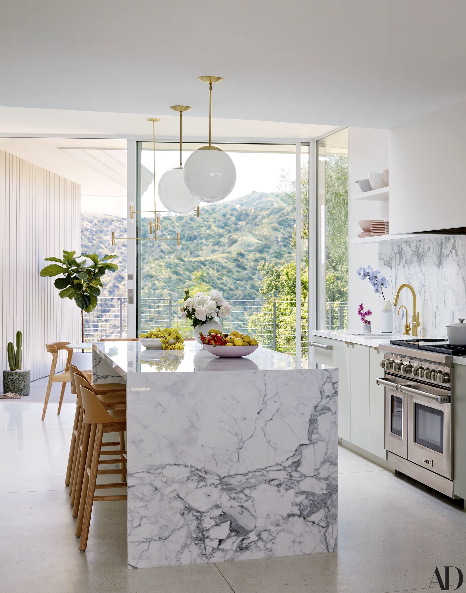
The luxurious kitchen reminds me of the House Curious kitchen with the marble island and Wolf hob and oven. We love the natural wooden stools that have been mixed in with the marble, brass and glass doors. I spy a Zip Water tap that every home should have - sparkling water, boiling hot water and filtered cold water on tap. Bye bye plastic bottles. Plus check out that view!

AD070118_WELL46_01.jpg

This home is a bungalow all on one level which means you can step straight out of this bedroom to the pool and patio area.

Trevor Tondro for Architectural Digest

Trevor Tondro for Architectural Digest

AD070118_WELL47_01.jpg

Key features we love

  • Restored original features

  • Terrazzo floor

  • Zip tap

  • Statement gold starburst light

  • Single storey layout

  • Fiddle leaf fig plant

Source: Architectural Digest


Photo Source: Echo and Earl

Photo Source: Echo and Earl

Palm Springs, California

A Frame Hideaway

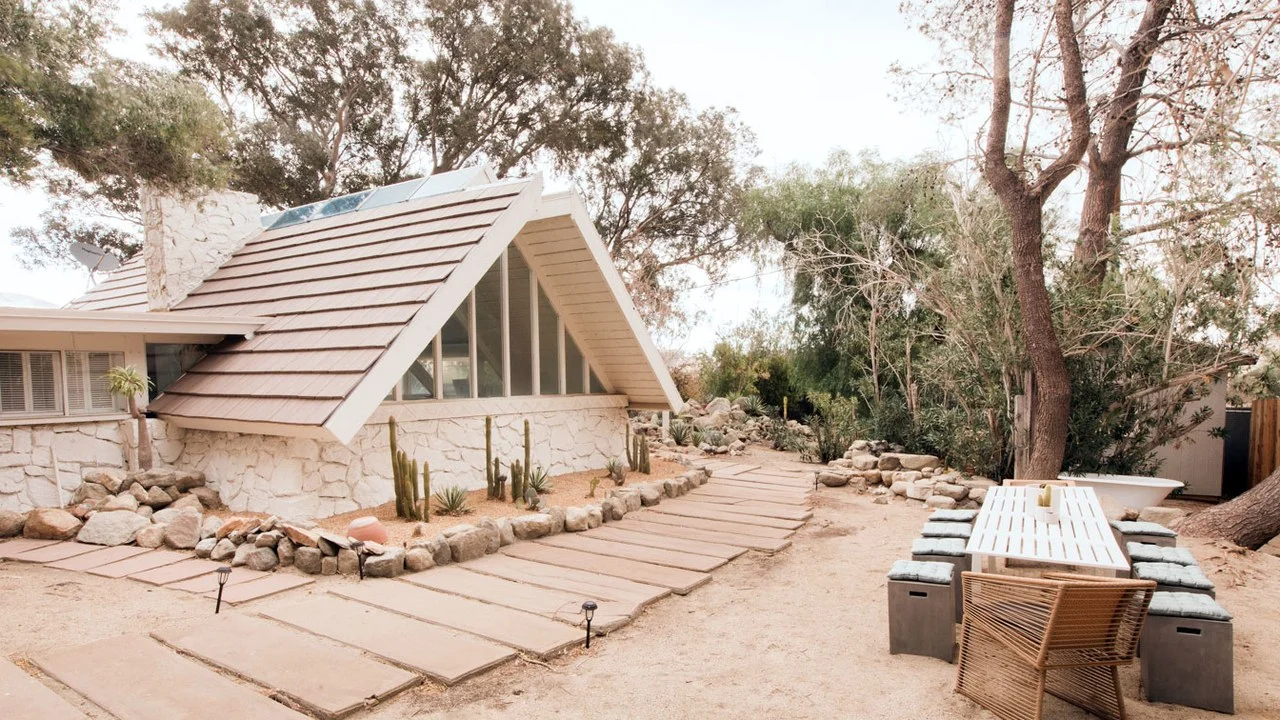
This dessert hideaway is the perfect place to escape away from the hustle and bustle of LA. A stones throw from Indio where you’ll find festivals like Coachella and Stagecoach. The house is surrounded by mountains, desert, cacti, waterfalls and trees full of fruit and olives.

The A-Frame structure is unusual and the colour makes it almost disappear, blending into the surrounding area. The structure reminds me of a great big tent - This is glamping to the extreme.

Photo Source: Echo and Earl

Photo Source: Echo and Earl

Owned by 3 creatives behind agency Echo and Earl they had a clear vision from the outset and wanted to create a space to hold retreats for like minded creative types. The A Frame House was previously owned by Sarah Sherman Samuel who was the designer behind Mandy Moore’s Pasadena bungalow above. You can see Sarah’s stamp on it, however the current owners have done a few updates with some clever ideas to overhaul rooms on a conservative budget.

Photo Source: Echo and Earl

Photo Source: Echo and Earl

Photo Source: Sarah Sherman Samuel

Photo Source: Sarah Sherman Samuel

If working with a small budget, paint can dramatically transform a space as you can see above with the white room. The kitchen can be a money pity but one clever way to save money is to keep the existing cabinet carcass and upgrading the doors and invest in premium handles.

Photo Source: Echo and Earl

Photo Source: Echo and Earl

Photo Source: Echo and Earl

Photo Source: Echo and Earl

Wall paper can dramatically change the way a room looks and feels. There are so many cheaper alternatives on the market these days so again this can be a good cost saver with little effort. I also like the idea of using ply wood as they have done in the bathroom. I love the rawness of this material and would look great in a moderne bright apartment.

Photo Source: Echo and Earl

Photo Source: Echo and Earl

The ribbed walls are a real statement feature in this room. Having been inspired by similar wooden walls from cafes and bars on their travels in Australia the owners wanted to recreate the look but initial quotes were expensive. Undeterred they looked at different options and ended up with PVC pipes as a great alternative. The point colour takes it to another level.

Photo Source: Echo and Earl

Photo Source: Echo and Earl

Photo Source: Echo and Earl

Photo Source: Echo and Earl

Photo Source: Echo and Earl

Photo Source: Echo and Earl

Taking inspiration from their surroundings the desert and earthy tones work brilliantly here.

Photo Source: Echo and Earl

Photo Source: Echo and Earl

One of the biggest investments was this saltwater pool, which is much needed in the desert heat. We love the tile detailing on the pool and it feels very much in keeping with the laid back Palm Spring vibe.

The veranda area with white gazebo is the perfect place to curl up with a book and a glass of wine. It really is a space to escape and get back to basics. You probably know that we are huge fans of hanging chairs and we believe they just add magic to any interior or outdoor space.

Photo Source: Echo and Earl

Photo Source: Echo and Earl

Key features we love

  • A frame structure

  • Bold wallpaper

  • Fun ribbed walls

  • Soft colour palette

  • Veranda complete with hanging chairs

  • Salt water swimming pool

Source: Clever/Architectural Digest


Photo Source: Peter Cook & David Agnello

Photo Source: Peter Cook & David Agnello

Jackson Hole, Wyoming

Jackson Hole House

The rural, sparse landscape of Jackson Hole, Wyoming is spectacular and the views of snow capped peaks and the vast valley of the Grand Teton National Park isa sight to be seen. The cabin that was designed by studio McLean Quinlan have created a stunning reflection of the extraordinary beauty that surrounds it.

Photo Source: Peter Cook & David Agnello

Photo Source: Peter Cook & David Agnello

Photo Source: Peter Cook & David Agnello

Photo Source: Peter Cook & David Agnello

This property blends into its surroundings much like the Ocean House in Australia, that we featured in our last blog post. It combines the styles of European Chalet and American cabin seamlessly. It just makes you want to hideaway and be at one with nature.

Photo Source: Peter Cook & David Agnello

Photo Source: Peter Cook & David Agnello

The materials used are both new, and reused and have been carefully considered to ensure that the structure blends into it natural surroundings. From stonework that will eventually invite lichen to grow, silvered cedar shingle wood that will weather with the rain, wind and snow. Even the planted sage bush on the boundaries will eventually merge the exterior of the house with the terrain.

Photo Source: Peter Cook & David Agnello

Photo Source: Peter Cook & David Agnello

Photo Source: Peter Cook & David Agnello

Photo Source: Peter Cook & David Agnello

Photo Source: Peter Cook & David Agnello

Photo Source: Peter Cook & David Agnello

The interiors mimic the exterior, with a reduced palette and use of similar materials, white walls, natural timber ceilings and floors, glass walls and stone detailing are the key. The glass walls allow the inside to come flooding in, even when they’re closed. The decor has been paired back for a clean and minimal look but when you have these views you don’t need anything else.

Photo Source: Peter Cook & David Agnello

Photo Source: Peter Cook & David Agnello

Simple futon style beds, wooden tables, chairs and stools furnish the rooms whilst linens and cotton soften the hard lines.

Photo Source: Peter Cook & David Agnello

Photo Source: Peter Cook & David Agnello

Photo Source: Peter Cook & David Agnello

Photo Source: Peter Cook & David Agnello

Key features we love

  • Natural materials and colour palette.

  • Simple furniture design that compliments the structure of the house

  • Statement Bath tub with views for miles.

  • Stunning landscape

  • Wide floor to ceiling glass windows/doors

  • Clean and simples lines

Source: Est Living


AD090119_JOHNSON_01.jpg

Brooklyn, New York

Ulla Johnson’s Brownstone

We couldn’t not feature a brownstone in our American home tour, New York has so many incredible properties and we simply had to show you this next one. The interior is eclectic with lot’s of colours and interesting art dotted around making use of dead space.

This home belongs to fashion designer Ulla Johnson and her husband Zach Miner. Buying property in New York is uber competitive and having lived in the neighbourhood for a few years prior the couple knew exactly which two streets they wanted to live on and raise their family.

AD090119_JOHNSON_04.jpg

Built around 1850 the house was perfect, not too big but enough space to fit the bustling family, plus the west-facing garden was just want Ulla Johnson had been searching for. To make the changes they were looking for Ulla has used the same team that is behind her store design.

This project was a mix of preservation, restoration and adaptation. The insanely intricate cornicing in the living room was painstaking restored, a solarium was added at the back of the kitchen wall adding an additional two feet and allowing light to flood in from the balcony beyond. A skylight floats above the curved staircase bringing more light inside. 

AD090119_JOHNSON_03.jpg

The interiors exude warmth and tactility, reflecting Ulla Johnson's boho inspired clothing but with a modern edge running throughout. It’s clear that the couple love textiles, and craftsmanship from metallic-threaded window treatments to living room Ikat sofa. Walls finished in blush-hued pearlescent plaster, and the hearths feature colourful marble inlays inspired by Italian mosaics. 

AD090119_JOHNSON_05.jpg
AD090119_JOHNSON_06.jpg

Rose marble has been used in the bathroom and compliments the warmth of the brass fittings.

AD090119_JOHNSON_07.jpg
AD090119_JOHNSON_02.jpg

The garden is so magical and is a real sanctuary from the surrounding buildings. A gorgeous path weaves between the heavily planted beds of peonies and wisteria leading to a relaxing patio.

Key features we love

  • Unlacquered brass hardware

  • Rose marble

  • Soap-coated chevron wood floors

  • Travertine floor in the bathroom

  • African-inspired design

  • Surfboard-style dining table, which they purchased from architect Arthur Casas on a trip to Brazil

  • Statement Artwork

Source: Architectural Digest


DSC_6143_197495732_298156001-1509x1920.jpg

Greenwich, Connecticut

Elegant New England House

This elegant New England home built in 1900 and extended by Pennoyer Architects is bursting with rooms. The cellar has a gym, family room, children’s play space, wine room and storage. The ground floor has a kitchen, sunroom, dining room, living room and library. The first floor has four bedrooms and bathrooms – one of them a master suite with separate dressing room and walk-in closet. There is also an additional guest bedroom and bathroom above the garage

Marble features heavily throughout the home but the entrance hall with its geometric pattern using two varying grey marble grabs you as soon as you open the door.

DSC_0513_203528321_298156001-1509x1920-1.jpg
DSC_0611_203528332_298156001-1509x1920.jpg

The hallway and stairwell of this colonial house are a focal point of the house. With a decorative banister twisting and turning up to each floor, that opens up allowing little to flood the space. A large asymmetrical brass light hangs like a mobile drawing your gaze from the ground floor all the way up.

DSC_6670_197495882_298156001-1509x1920.jpg
DSC_6242_197495772_298156001-1509x1920.jpg

The colour palette for this house is white, grey and natural wood. It has been given a real face lift by Britt Zunino, co-founder of New York design practice Studio DB.

Statement light fittings are a theme throughout this home creating a focal point in every room.

DSC_6191_197495751_298156001-1-1509x1920.jpg

The house has a luxurious but not flashy feel to it, in the kitchen marble features heavily, covering the walls, oven hood and kitchen island. 

DSC_6516_197495832_298156001-2-1509x1920.jpg
DSC_6754_197495911_298156001-1509x1920.jpg
DSC_6862_197495942_298156001-1-1220x882.jpg

There are unexpected surprises from the marble walls in the kitchen to the bright teal paint on the panelled walls and ceiling of the library. The brass drinks trolley in the corner, the perfect bar set up.

DSC_6886_197495961_298156001-1509x1920.jpg

Our favourite room of this house apart from the hallway has to be, you guessed it, the master bathroom. The striking grey marble floor panel and splash back make it look as though the white bathtub is floating.

Key features we love :

  • Statement entrance hall and staircase

  • Stonework fireplaces

  • Geo marble floor

  • Teal panelled library

  • Minimal colour palette

Source: Architectural Digest

We hope you have enjoyed the latest House Destination. Please comment below and let us know what you think. We can’t wait for the next stop in our whistle stop tour around the world, so stay tuned x

If you missed the first instalment of this blog series click here for House Destinations - Australia.