Contact Us

Use the form on the right to contact us.

You can edit the text in this area, and change where the contact form on the right submits to, by entering edit mode using the modes on the bottom right. 


123 Street Avenue, City Town, 99999

(123) 555-6789

email@address.com


You can set your address, phone number, email and site description in the settings tab.
Link to read me page with more information.

House Curious

Lifestyle and interior shop. Social workshops for the creatively curious.

Filtering by Category: Home and Design

MY SPRING TRENDS

Sommer Pyne

spring.jpg

Spring is on it's way, and it brings a fresh new energy. Do you feel it? I feel just that little bit lighter and brighter and it’s much easier to jump out of bed in the morning. It’s as if we’re peeling away the dark heavy layers of winter and throwing them in the bin. I feel really inspired at this time of the year, especially when it comes to my interiors. I have an urge to clean, sort and breathe new life into my house. This usually means a trip to the New Covent Garden Market to buy more plants, changing linen, new cushion covers and cleaning out my cupboards etc. I’m not massively into following trends but here are a few loves that have stood the test of time or should I say that I think are still going to be relevant this Spring:

Photography by Gavin Smith

Photography by Gavin Smith

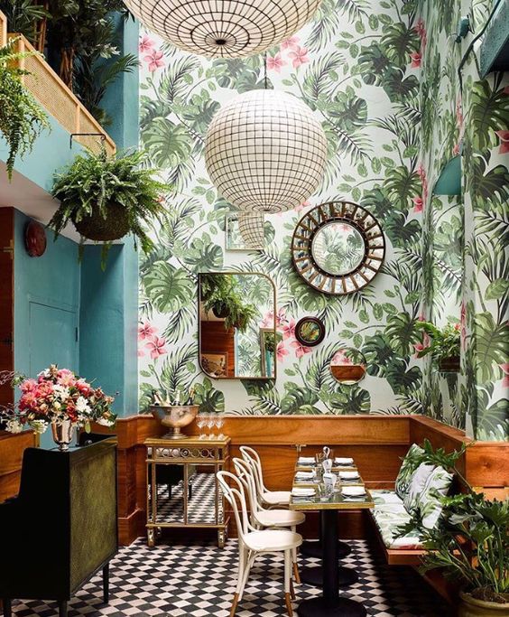
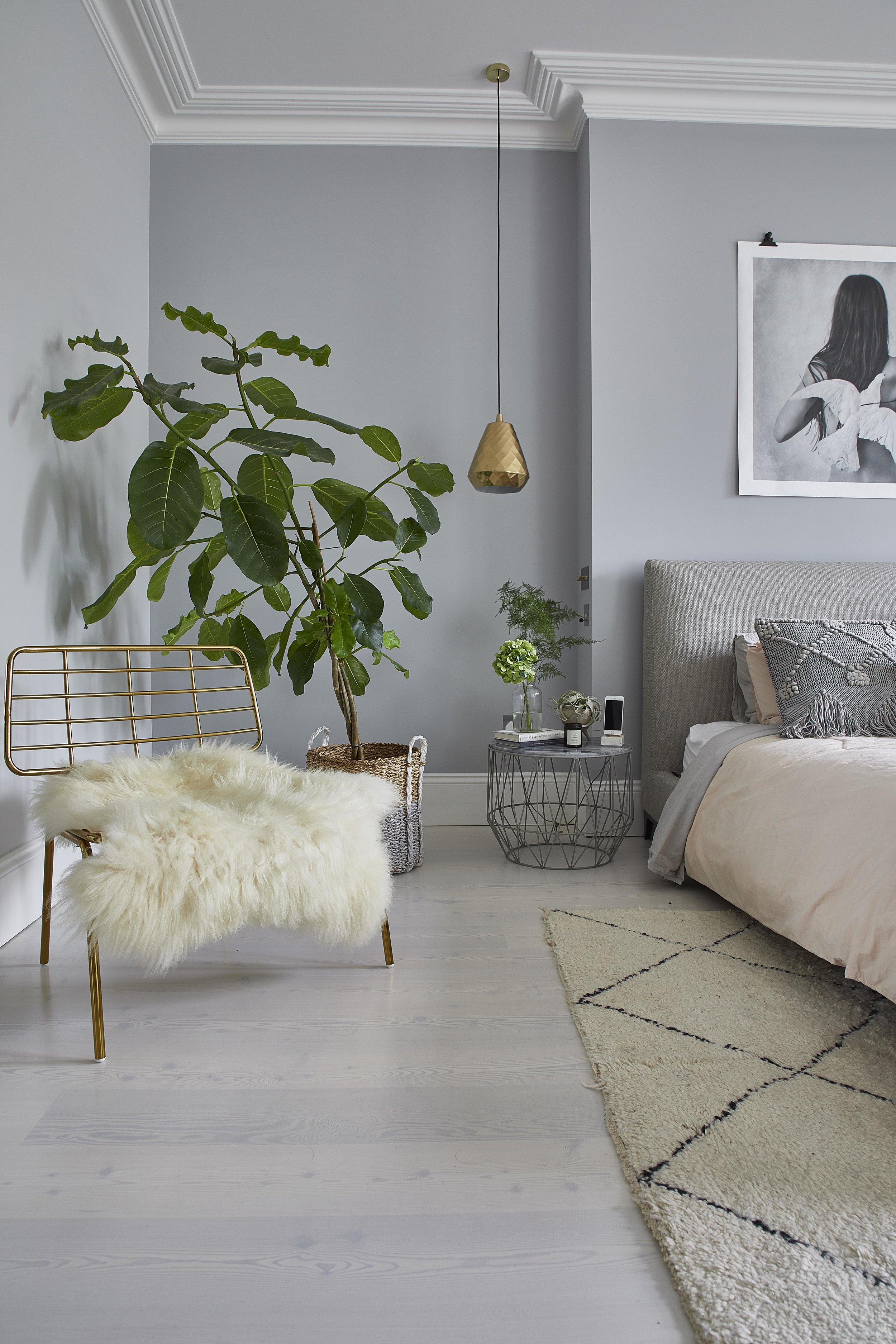
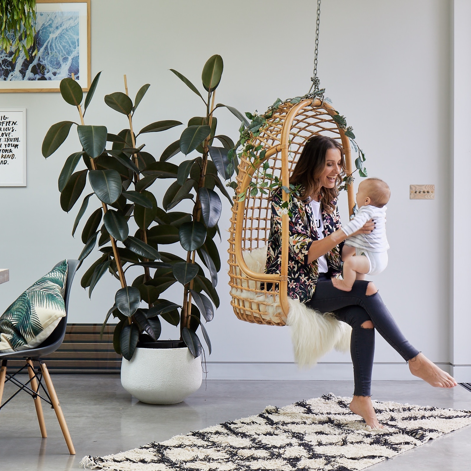
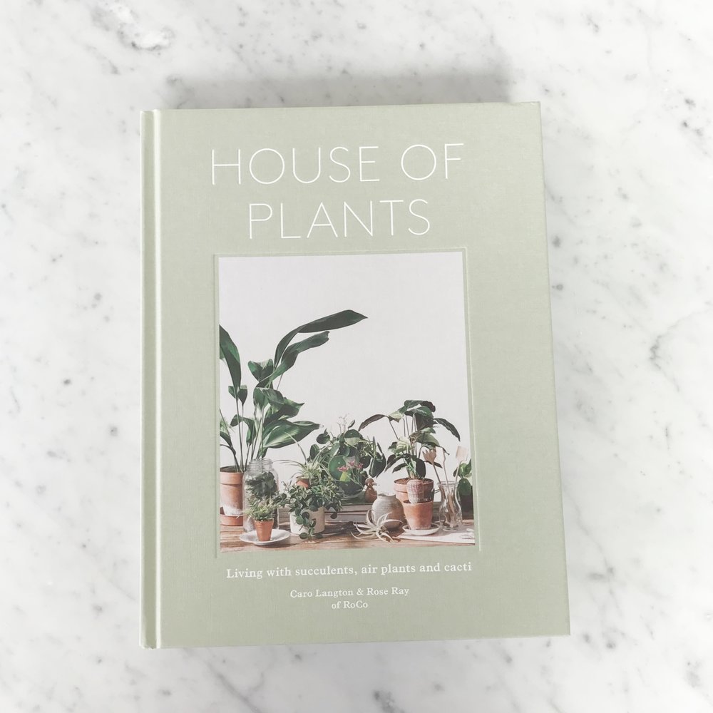
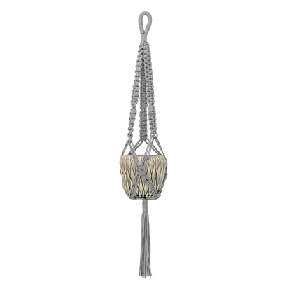
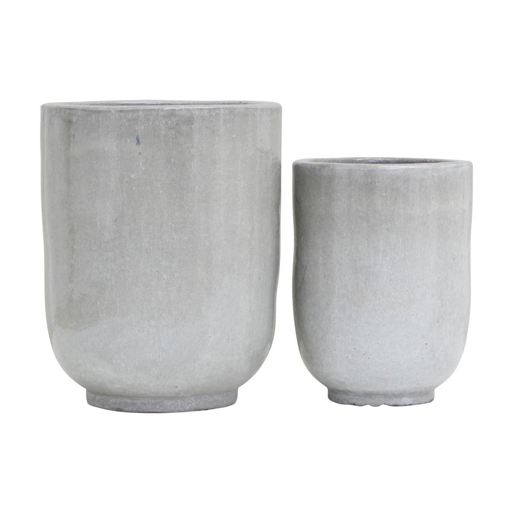
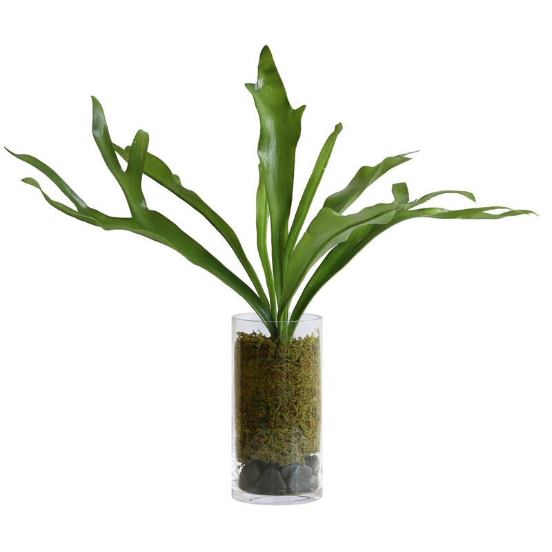
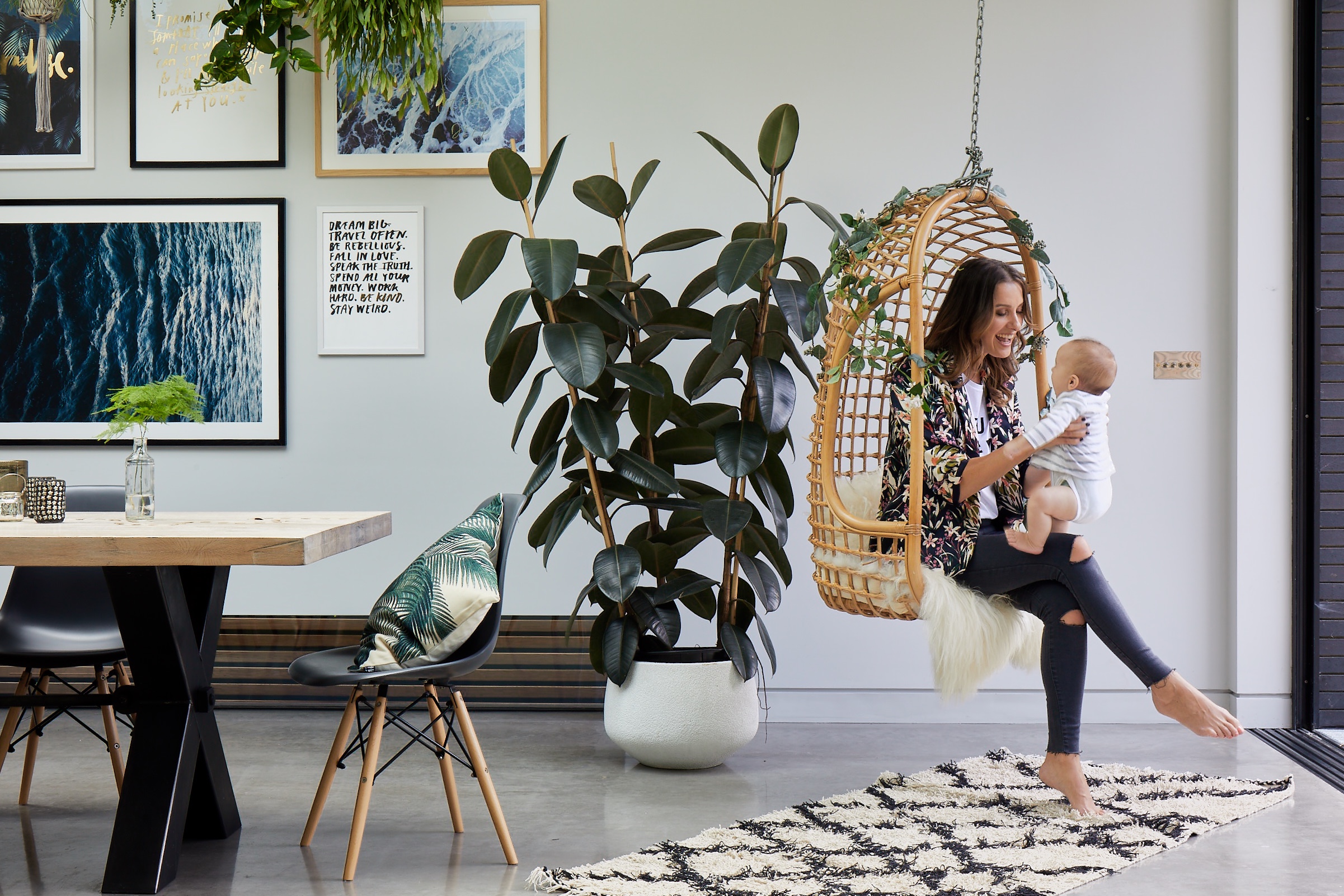
Botanicals: Our love affair with indoor plants is as big as ever. As you probably know I love filling my house with greenery and bringing the outside in. I think plants are the best accessory for a dramatic impact or filling a sad empty corner, instantly breathing life into a room. Hanging plants look incredible and can add so much drama to a room. I had these metal grids created to hang plants and it literally made my heart skip a beat. My fav plants are tropical plants such as a fiddle leaf figs, bird of paradise and banana trees. The planters you use to house your plants are also just as important. I like to mix mine up by using baskets, oversized concrete pots or even wrap the plant pot in craft paper with string for a more rustic look.

0fb39708aa6f350fbf4d433821ffa189.jpg

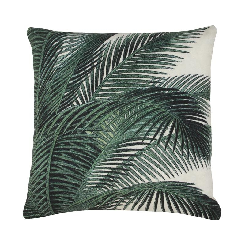
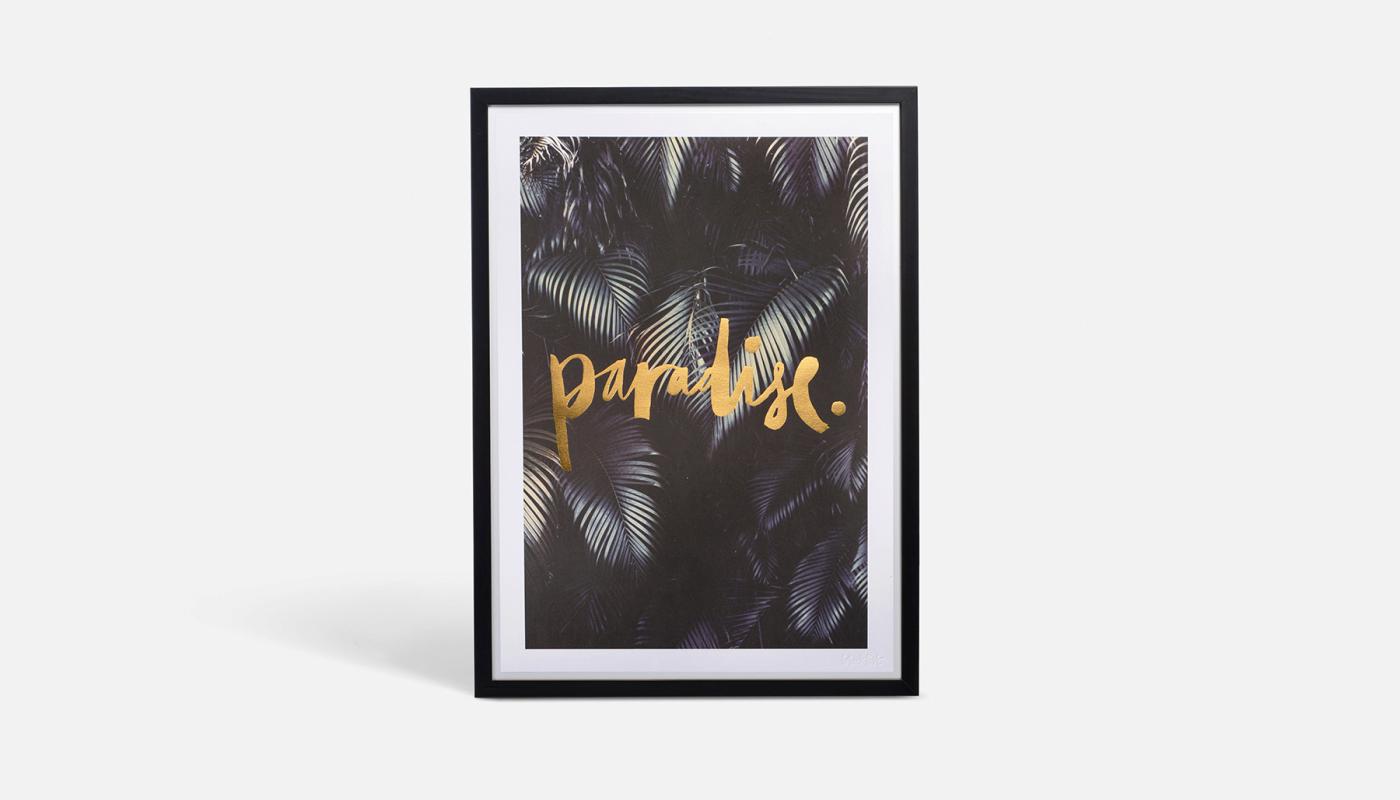
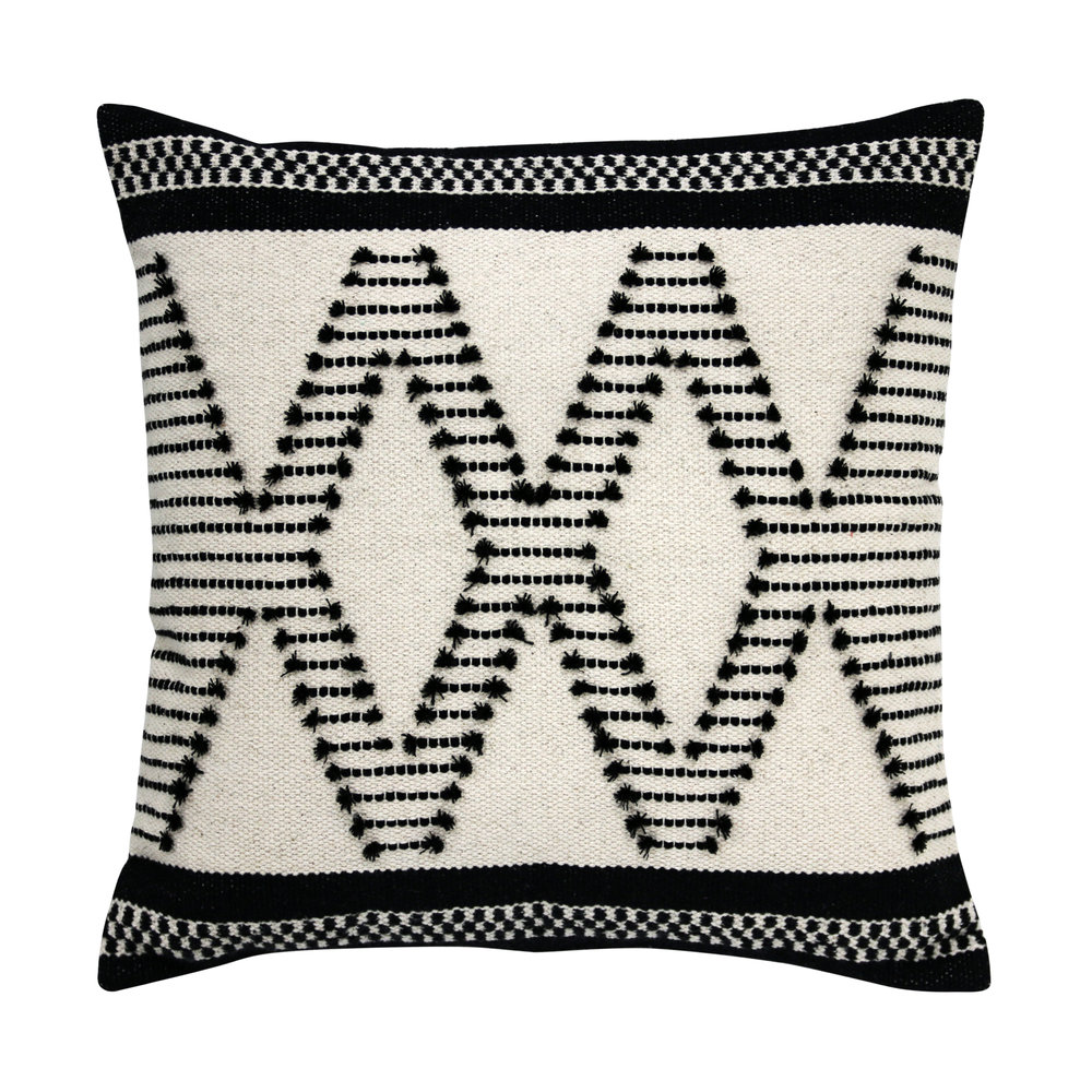
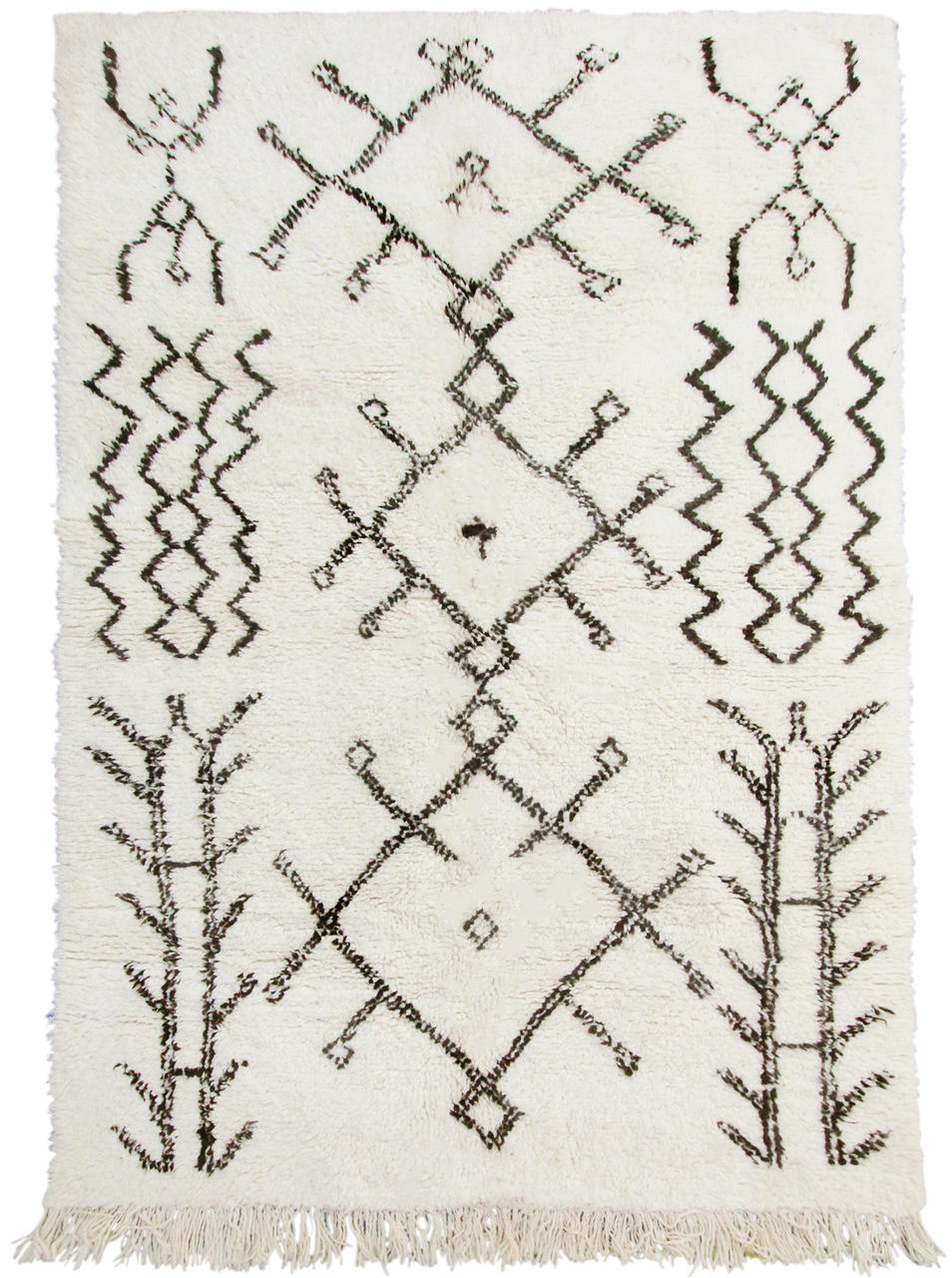
Bold prints: The botanical love affair spills over to homewares and fashion with bold tropical prints and lush green florals. I also think that we’re becoming more confident in our interior choices and playing it less safe. Geometric and tribal prints will also be featured in homeware this season. Go on go bold this Spring!

Photography by Gavin Smith

Photography by Gavin Smith

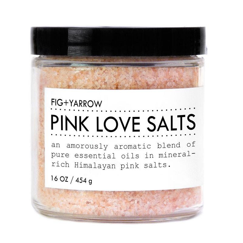
Spa bathrooms: You only need to glance at Pinterest to see that luxury spa style bathrooms are as popular as ever. In fact, that was my inspiration for when I designed my master bathroom. I wanted to create a sanctuary; a place that I could truly relax from the craziness of the outside world (and hide from the kids). Think large deep baths, marble, muted grey large tile slabs, rain showers. Displaying your beauty products and hand soaps on a tray gives you that luxury hotel feeling. If you don’t have the luxury of designing a bathroom use accessories and treat yourself to a Love salt bath, put on a facemask, light candles and put your favourite music on. Just make sure you lock the door!

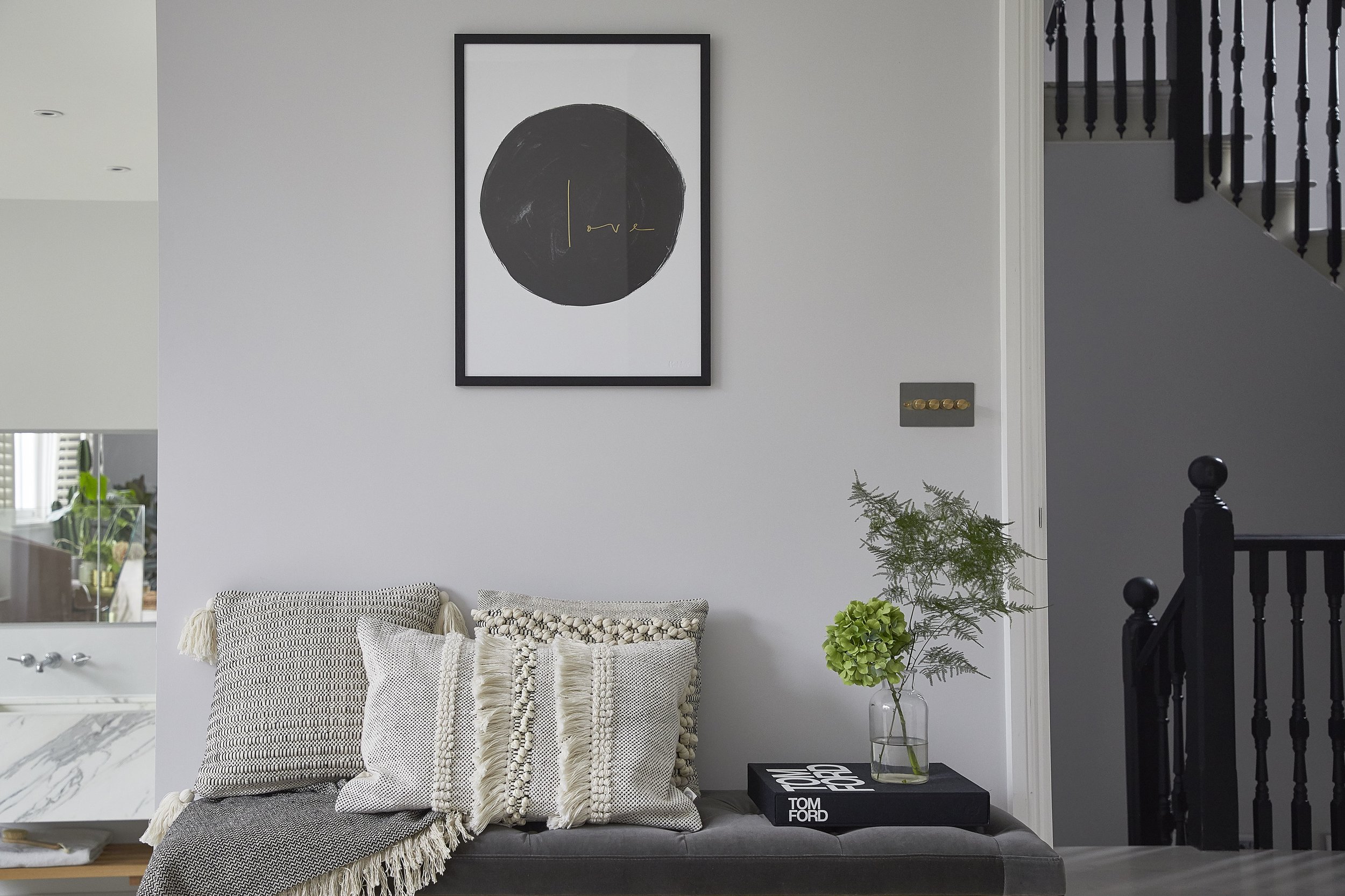
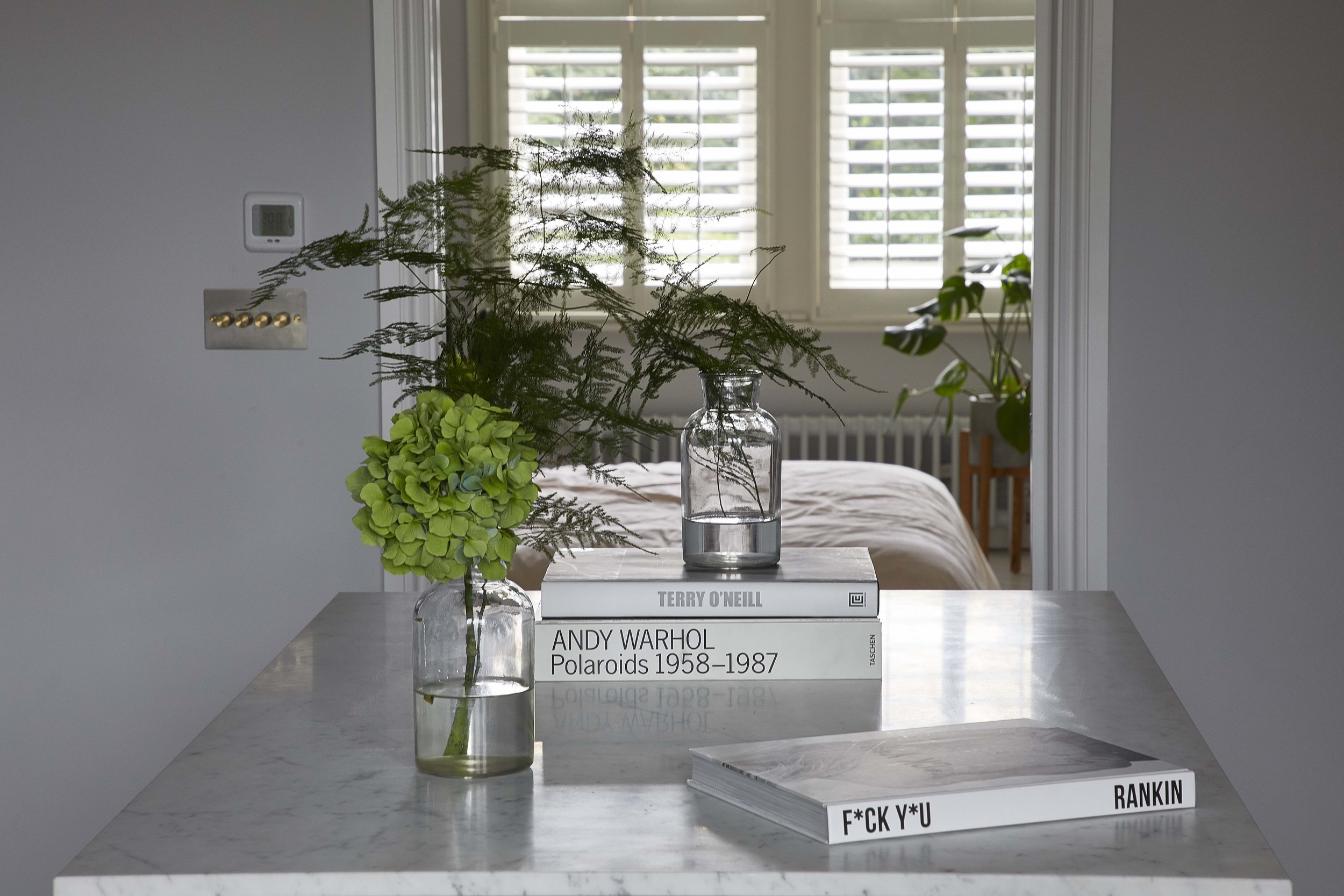
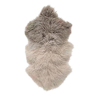
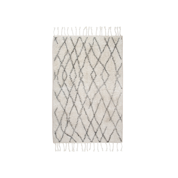
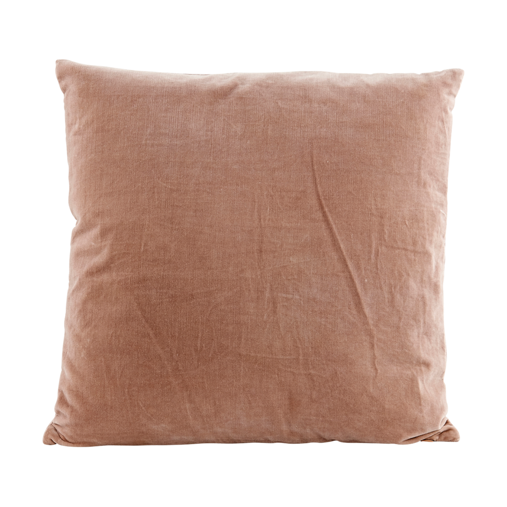
Textures: I personally feel that having a mixture of textures is your home is important to create a well-balanced home. Mixing textures, patterns and different materials is the way forward. Layering is key and for me this is the trick to making a room feel finished. Think velvet cushions, throws, sheepskin, trays with candles, fluffy rugs under furniture, books stacked on tables. Wood and other natural materials such as concrete and marble help you feel more grounded. Leather is also a material that is popular this year; think destressed leather dining room chairs, bedheads and bespoke upholstered leather sofas. I’m saving up for some leather chairs in the dining room.

Photography by Gavin Smith

Photography by Gavin Smith

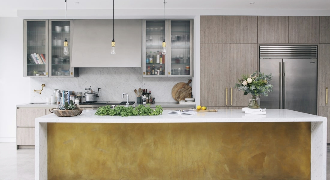
Mix metals: Gone are the days when you must stick to one type of metal. For a more modern approach mix stainless steel with brass or gun metal grey with gold. In my kitchen, I have used stainless steel cabinets mixed with brass handles and my light switches from Buster and Punch also use a mixture of metals. So be bold and mix it up.

Photography by Gavin Smith

Photography by Gavin Smith

Colour trends: The colours that I think have stood the test of time and feature throughout House Curious are a combination of dark inky grey and blues, earthy natural tones and my fav at the moment, muted pink and green. Maybe it’s time to paint that reception room Railings or Hague Blue by Farrow & Ball. Weave in pinks and greens with soft furnishings or if you’re brave use these gorgeous pink tiles from Topps Tiles in your bathroom. I did this for a client recently and it looked amazing. I tend to use lighter tones of grey like Blackened in the hallways to connect rooms but there’s no hard and fast rule. I've seen hallways painted in olive green or deep rich blues and greys that also look amazing. Painting rooms has the biggest impact on transforming a room but you can always introduce different colours through accessories and decorative objects. 

Shop the story


HOW I USED MY HOME TO SET UP MY DREAM BUSINESS

Sommer Pyne

Photo by Gavin Smith

Photo by Gavin Smith

Your home can be so much more than just a roof over your head.  My home is my sanctuary, creative hub, a family home and my business. My business was built on using my home to host gatherings where people could learn a craft and share a meal together. I love sharing my home with new friends and the energy I see when people gather for shared passions is super satisfying (see our next event here). 

Your home can be used in so many wonderful and creative ways. And it may even make you a bit of money on the side! A little extra cash to put on the mortgage or extra money to hit the shops sounds good, right? The only limitation is your imagination - think pop-up shop, supper clubs, airBnB or even a location for films and fashion shoots.

Screen Shot 2018-02-21 at 10.24.45.png

Who’s been watching the BBC drama McMafia, based on the Russian underground criminal world? The eight-part series finished last week but you can watch it on catch-up if you missed it. You may have noticed something familiar about the main character Alex Godman's (played by James Norton) house. Not only have I been enthralled in the storyline but I was intrigued to see how my Victorian house was to be transformed into a mews house which features throughout the series. Did you spot it? I’ve had quite a few people asking me if it was House Curious and they would be correct!

Photo by Gavin Smith

Photo by Gavin Smith

I often rent my house out for fashion shoots and commercials but this was a much bigger production and it took a lot of convincing initially for us to agree to the filming. Yes, it’s exciting but I also love my house and inevitably with a big production crew of 50 or more damages were inevitable. We also needed to move out for two and a bit weeks whilst the set designers transformed our house and filming took place.  We were lucky enough to be put up in a hotel because it wasn't realistic to stay in the house while they were filming. The production crew removed my furniture and replaced it with different furniture and accessories. They even built fake walls and windows to turn the house into what we see as a mews house in the programme. The only piece of furniture that was mine was the bed. Not many people can say that they had James Norton in their bed lol.

Photo by Gavin Smith

Photo by Gavin Smith

I’ll admit, the shoots can at times be quite disruptive to family life. But if you’re prepared to open your home, it can be quite lucrative! It’s worth remembering that any style and size of home can work for shoots, you never know what the creative director’s vision is! 

Photo by Gavin Smith

Photo by Gavin Smith

The money I have made has allowed me to set up the House Curious shop. Without this I would have needed to get a loan, so for me it's been a positive experience and allowed me to set up my dream business. If you’re thinking of using your house as a shoot location here are some things to consider when preparing your home for its close up:

It’s best to list your home with a few location agencies. Do your research though as some agencies may be better suited to your type of property.

You will need good quality photos of every room that can be uploaded to the location agencies site.

The agency takes 20% on every job and as it’s an income you will also need to pay tax.
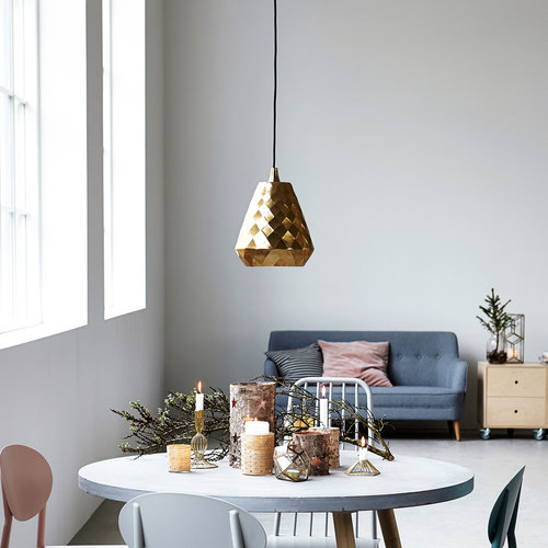
Depending on the job they may ask if they can wallpaper a wall or paint a room. I always opt out of these jobs but for some people this could be a bonus and a chance to update a room for free.

Having house rules is really important so make sure the agency is aware of your rules.  I have a no shoe policy, no dragging of furniture, all rubbish must be removed, floors must be protected from equipment etc.

A central location within the M25 is desirable and off street parking is a bonus but not essential.

All production companies have their own insurance but it’s worth checking with your home insurance that you don’t need further cover.

The Agency that got me the job with McMafia was JJ Connect and the other main Agency that I’m listed with is 1st Option.

I hope that gives a little insight into using your house as a location venue and making a little extra cash on the side. If you have any other questions that you would like to know about renting your house out for shoots please ask below and I will answer each question.

Have a great day,

Sommer x


Sommer Pyne

If you have been following me for a while you will know that I've spent the last two years renovating and decorating my home. I decked my house out with furniture and accessories but no matter what I did something didn't feel right and I couldn't quite put my finger on it. It wasn't until last week when I took some time out and I started experimenting with some of the lighting from our new collection that the penny dropped. I missed the most important thing; lighting! Get it wrong and it's an instant mood killer. I was too preoccupied with colours of the walls, accessories and making sure it all looked perfect that I forgot that one simple thing. Mood lighting. Here are a few tips I've picked up along the way to get the right balance:

3976649500000578-3851852-_This_is_where_I_come_to_hide_laughs_Sommer_whose_first_floor_ma-a-25_1476890654624-1.jpg

Multiple lighting sources

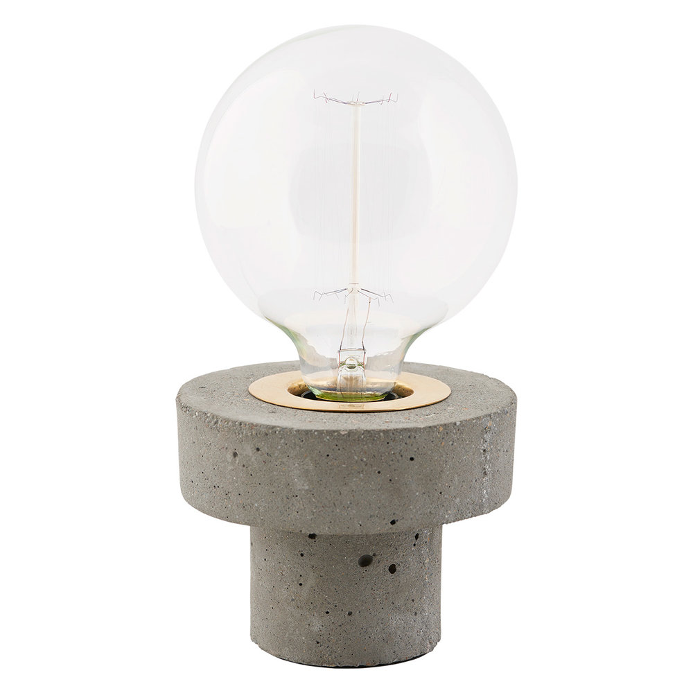
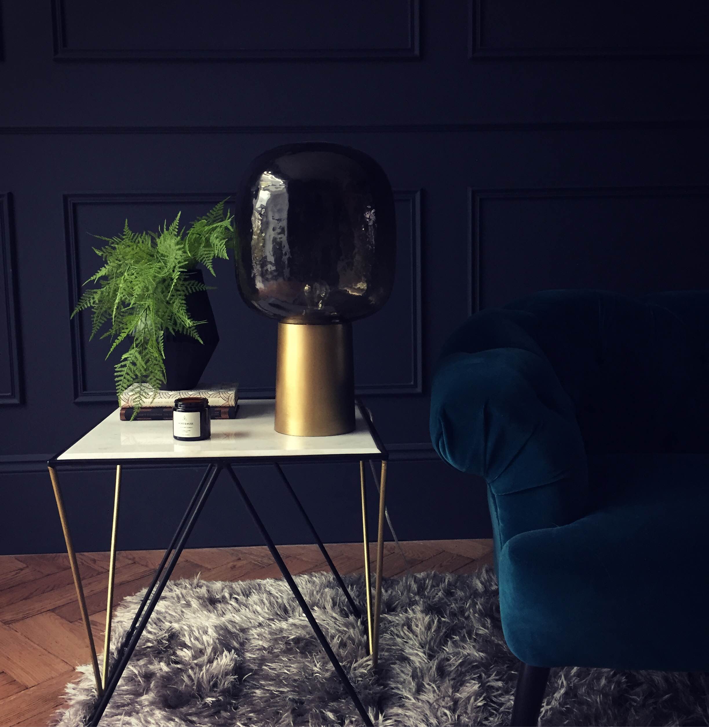
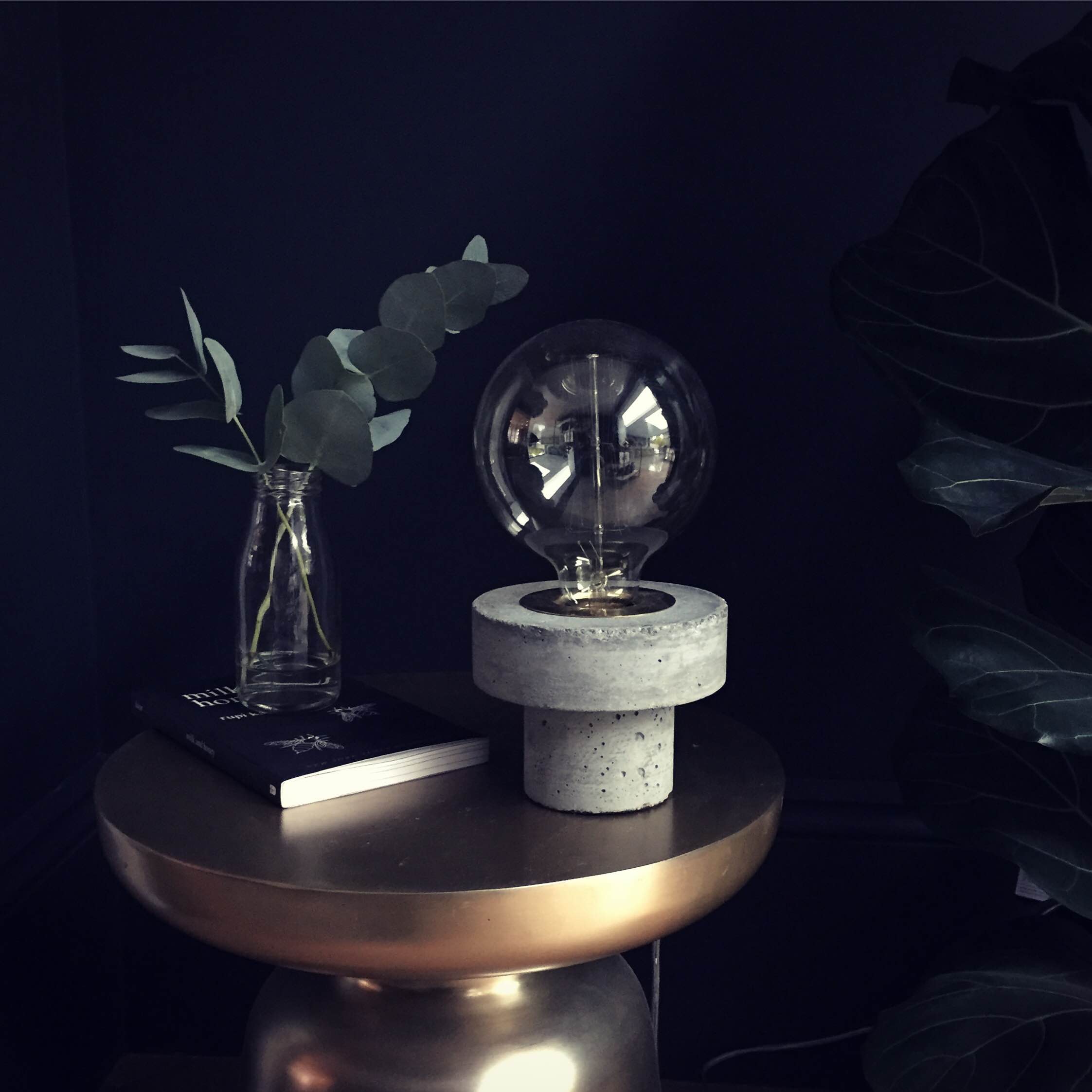
It's a common mistake to think about lighting the whole room. Instead try using multiple light sources lighting up corners, accentuating architectural features, using tables lamps and floor lamps. This style of lighting is much more subtle, warm and inviting. It's not just about using standard lights, think about candles, low wattage eddison bulbs and experiment with different lampshades. Placing lights at different heights also helps create interest and adds a subtle drama to a room.

Buster and Punch light switch

Buster and Punch light switch

Dimmers

It seems like a no brainer to me to use dimmers in every room, even the WC. It just gives you so much flexibility and you can create different moods depending on how you wish to use the room. I'm told that this is a great way to save energy and your bulbs last longer. 

Function of the room

Think about the room and how you wish to use it. Do you want to create a warm cosy feel or is it a place where you're going to work, in which case you may want to consider functional lighting. This kind of lighting is more practical, think desk lamps, bathroom mirror lights, kitchen lights for prepping food etc. Each room has a different function so you should treat each room separately. A good place to start is to write down what you will be doing in each room and what you want to highlight and importantly the mood you want people to feel when walking into the room. If you are renovating it really is worth spending the extra money on a lighting designer or if you are using a good interior designer they should be able to help you with the lighting plan.

If you're in London and you get a chance visit the Edition hotel, it's not only beautiful but it's a perfect example of good lighting design. I absolutely love it and it's the kind of place you don't want to leave. I could happily spend the afternoon sipping cocktails and admiring the view.

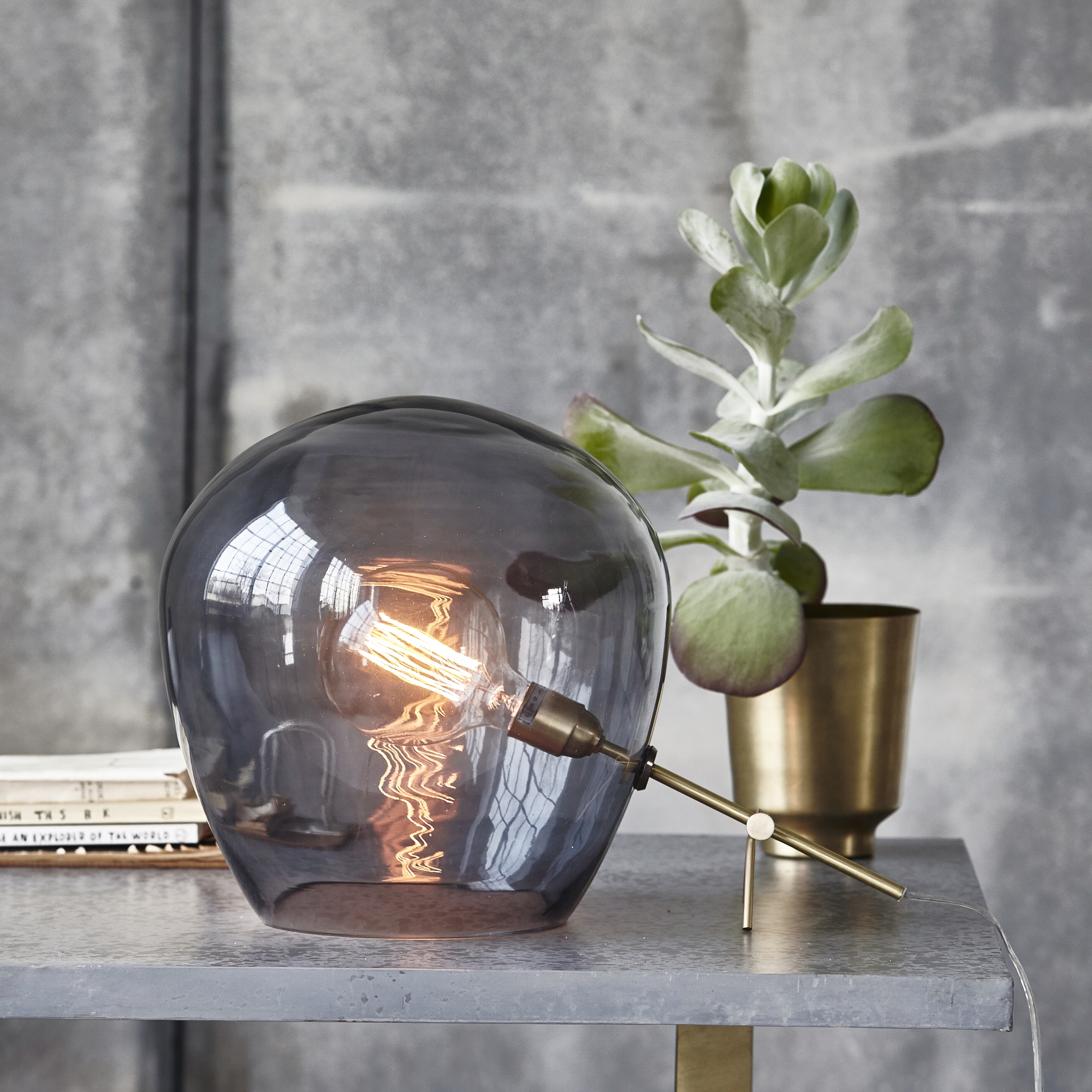
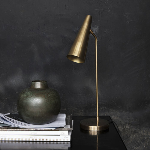
Here's a selection of the House Curious lighting collection to get you thinking about the possibilities.