House Destinations - Australia
Sommer Pyne
Photo by Kevin Bosc
We’re taking you on a journey around the globe as we share our favourite design led homes that are bursting with interior and architectural inspiration. Each week we’ll be visiting a new country, sharing hand-picked drool worthy homes for you to feast your eyes on. First up we’re starting with Sydney, Australia, my home town.
As a city Sydney has so many varying characteristics from chic city living to beachy vibes, laid back living, colonial history and a love of the outdoors. Mix this in with influences from Asia, UK and India as well as Australia's own hot and rugged landscape and you have an exciting and eclectic selection of interior trends to pull from when designing your own home. We have picked 4 home styles that represent this cocktail mix of interior design.
Spatium Warehouse
Annandale, Inner West, Sydney
First up is this industrial warehouse space that has been transformed into a multifunctional space. Cleverly designed to be used as a family home and a workspace. The building is located in Sydney’s Inner West suburb and was formally a 3 unit warehouse space with metal foundry and automotive workshop.
In November 2013 Joe Sidoti, acquired the property. Inspired by a passion to bring new life into it’s worn out walls. Joe’s vision was to transform this vacant warehouse into an exquisite family home and still respect and display it’s warehouse history.
Photo - via BresicWhitney
Photo - via BresicWhitney
The former warehouse in Annandale has been opened up to have a double height living and dining area which is flooded with natural light from the courtyard and terrace. A mezzanine floor links the bedrooms above. The history of the building has been uncovered and restored revealing the building's past. Windows have been restored and the structure has a raw industrial feel to it which is softened through the interiors and furnishings.
Photo - via BresicWhitney
Photo - via BresicWhitney
With bi-folds doors the interiors flow into the courtyard which is a key trend when it comes to properties in Australia, making the most of the great weather.
Queen’s Park House - Sydney
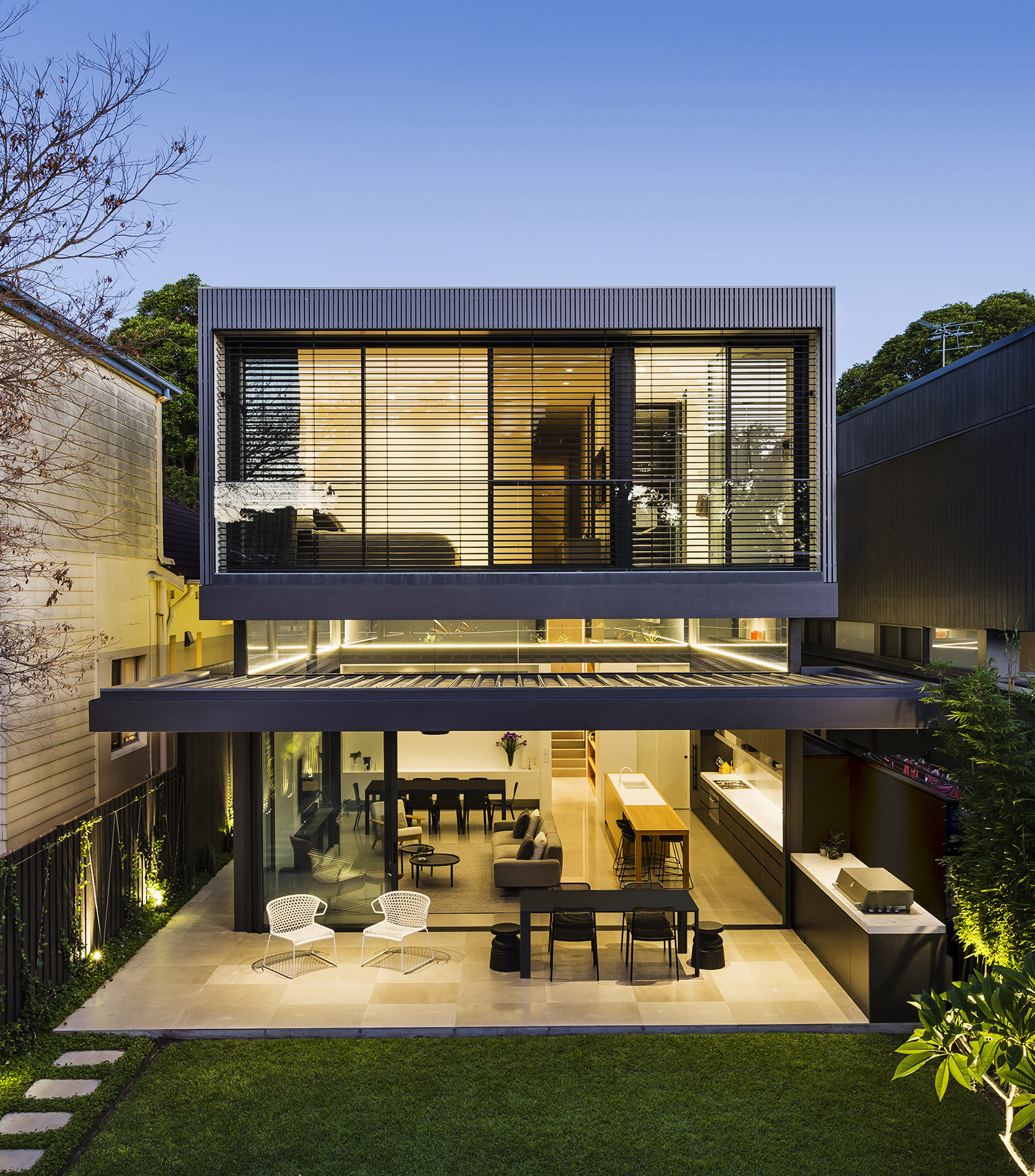
This home isn’t all that it seems from the offset. Based in a heritage conservation area in Sydney’s East suburb, the challenge from the homeowners to the architects was to give a modern update to the house whilst keeping the existing facade, so that the house continued to blend in with the houses on their tree lined street.
The architects kept the facade, plus the two front rooms and part of the roof form of the original home which seemed the most suitable for the street. By doing so the property flows and allows the two storey extension at the rear to remain somewhat concealed. The structure behind blends into the roof due to the clever use of the folded form and angles that merge with the existing slate roof.
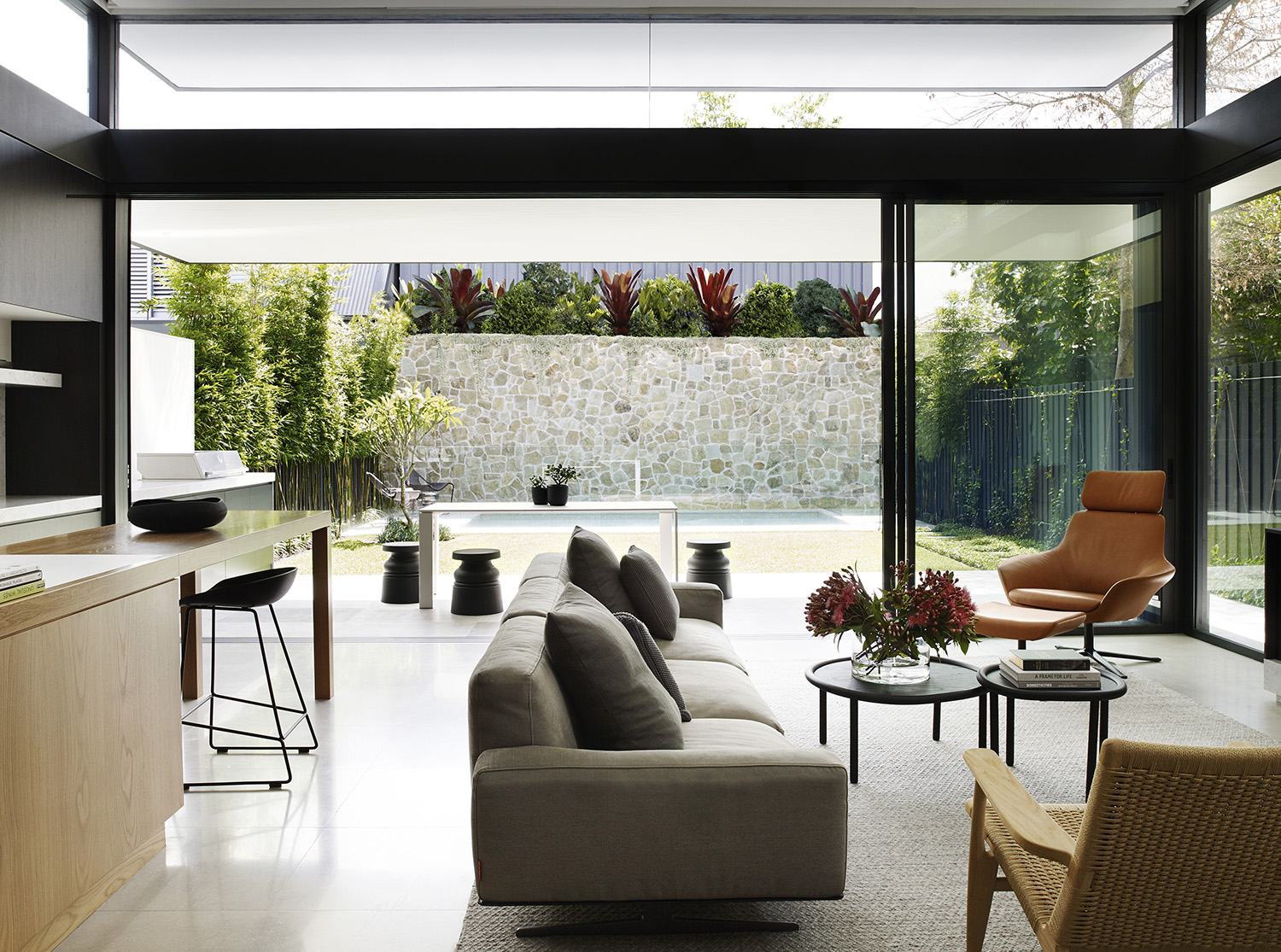
There is a modern, open and airy feeling to the homes living areas that reaches out in to the garden. The rear of the property is lower creating 4m high ceilings which adds a different dimension to the property. Windows and glass feature throughout allowing light to flood in. A large cantilever over the veranda provides much needed shade from the Australian sunshine.
The materials and palette used on the exterior and interior have been quite simple with black, white and timber being key. The neutral interiors, mix natural wood, white walls and concrete floors. The properties furniture, fixtures and fittings follow suit and add softness with soft furnishing and a touch of luxury from the marble in the bathrooms.
This building really proves that you can keep original features or even the front of a house and blend it with a modern extension seamlessly. With simple updates at the front like the fence and paint refresh to tie up the look. It is simple but stunning.
Lana’s Forever home
North Shore - Sydney
Our next property is Lana’s Forever home which was created by our favourite ladies Three birds Renovations and as we do with all their renovations, we fell in love with this home in Sydney's North Shore. It’s totally up our street and we want to move in.
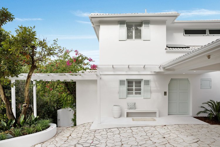
The design has been influenced by the greek islands of Santorini and Mykonos and the modern hotels that keep popping up. There is such a huge trend at the moment for this modern boho look.. The property has gone through quite a transformation, however Lana has kept original features such as the front door, shutters and cornicing whilst adding the Three Birds stamp on it.
There is one key colour, white , which is used throughout the house from the walls, floors, and furniture. She mixes in accents of natural wood and marble for a luxury feel. There are splashes of soft colour which break up the monochromatic interiors. Blush pinks and oceanic blues are picked up in the soft furnishings, the rug in the living room which reminds Lana of the ocean and a fish scale tile wall in the bathroom that is a great statement feature.
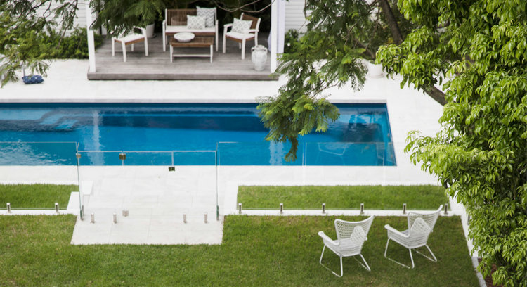
The indoor/outdoor feel was a non-negotiable for the property and is a theme in most Australian properties. And of course a stunning and inviting pool which was a late addition rounds off this stunning property.
Since the renovation and design process Lana shared a few words of advice in hindsight.
Be open to the opinions of others, a visiting tradesman remarked on extending the space to open up the living area which wasn’t part of the original plan. He had seen 100s more properties in his career and looked at the house with fresh eyes.
Having your heart set on certain design features might not always work on the specific property. "I had my heart set on floor-to-ceiling mirrors in my room, as I thought it would open up the space and bring the outdoors in. I was so set on it that Bonnie had to stage an intervention! She said it was too modern and flashy and didn't suit the Mediterranean look. I was so annoyed at the time, but I knew that it didn't suit what I was trying to achieve so I had to let it go. Now, I have pure white wall with a beautiful piece of art on it and it's just perfection."
Re-evaluate what is important to you and how you’ll use the space when planning. "We have two kids, we're not having any more and we don't love having house guests – so we didn't need a guest room collecting dust and taking up valuable floor space,"
Ocean House
Great Ocean Road, Lorne, Victoria
Just 1hr and 45min drive out of Melbourne along the Great Ocean Road and you’ll find the Ocean House. It blends into the rugged wilderness surrounding it and sits above the crystal clear swirling ocean below, blink and you’d miss it. Designed by architecture company Robert Mills Architects and Interior Designers it is simply stunning.
The glass and timber pavilion really does sink into the landscape around it. Complimented by the soft colours of the chalk-rubbed hardwood and polished concrete, the house features circular bedrooms, curved staircases, wrap-around terraces and a rooftop deck with an open-air bath, it’s a real place to escape.
The interiors feature statement furniture pieces tie the exterior and interior together. Est magazine visited the Ocean House and wrote that ‘Sinking into the Piero Lissoni sofa to soak up the sea views is a sure treat when it comes to getting comfy at Ocean House. Other notable design objects to grace its halls are the Andrew Lowe table and Patricia Urquiola bed, as well as the lower floor curation of furniture by De Padova, Jardan and Eero Saarinen – some of Rob Mills’ favourite designers’.
We love the timber ceiling and how all the materials and design blend into the landscape. The biggest take away for me is to to draw inspiration and have respect for the natural surroundings. Everything works so beautifully together. You can tell that every detail has been carefully thought through even down to the soft furnishings that compliment the natural timber and polished concrete adding calming tones to this Ocean House.
Tune in next week as we reveal our next series on our global house tour x


